In the first part of this series, we learned what dithering is, why we might want to use it, and a few different ways to apply dithering to an image. So far we've only seen pure black and white implementations. In this article we'll dive deeper into proper implementation of dithering algorithms, taking a look at some issues we skipped over last time and the color versions of these algorithms.
The basics of dithering are well covered in the previous article, so we'll be picking up where we left off. If you haven't read the first part, I highly recommend you check it out before reading this one. That said, let's start by looking into something I intentionally left out of part one:
Gamma correction
You might have noticed one of the interactive demos in the first article looked a bit different from the rest:
This example, used to explain the principle behind ordered dithering, looks very bright and “washed out”. That's because it's not doing gamma correction, a process necessary to make dithered images accurate which I snuck into every other demo, neglecting to mention it for the sake of simplicity. This one skips it in order to keep a 1-to-1 mapping between the brightness level of a “tile” and the pattern applied to it. With gamma correction applied, the same demo looks like this:

So what is gamma correction, and why do we need it to make dithered images accurate?
How it works
The reason we need gamma correction when dithering has to do with color mixing, and the way monitors work, which is in turn a consequence of another little quirk in the way our eyes themselves work.
In short, the human eye has a non-linear response to light: we're better at perceiving small changes in brightness in darker places than overall brighter ones. What this means is we don't see twice as much light as twice the brightness: what we see as a “50% gray” actually reflects only about 20% of incoming light.
Monitors benefit from encoding color in the same non-linear way: brightness becomes perceptually uniform, which makes working with color much easier, and out of all the possible brightness levels (256 for most screens), more are dedicated to the darker tones where we can better spot small changes in brightness.
This non-linear encoding is usually achieved by means of a power function, with brightness values between 0 and 1. This makes the midtones darker, while keeping black and white values the same:
The exponent of this power function is called gamma. Most screens use a gamma value between 2.2 and 2.4, which gives an output of about 20% brightness for an input of 50%.
Dithering and gamma correction
When dithering, we need to account for this curve: since we're telling the monitor to draw only black and white pixels rather than gray, we have to provide the right mix ourselves. That means if we want a 50% gray, about 20% of the pixels should be white, not half of them.
The demo below lets you adjust the gamma value used for dithering a simple black-to-white gradient:
With a gamma of 1.0, or no gamma correction, the dithered gradient looks brighter than the original. Try adjusting gamma until both gradients look roughly the same. The value should be close to your display's gamma setting.
To better understand the effect on dithered images, you can play around with the gamma setting in the demo below, which uses ordered dithering.

Implementing gamma correction is fairly simple, as all we have to do is apply the power curve to the image before dithering it.
Color dithering
So far, we've explored dithering techniques for converting images into two-tone black and white. This saves us a lot of complexity when looking at the different methods used for dithering images, but it's fairly limited in what in can do. What happens if we want to dither color images? How about displaying images as best we can in a limited, arbitrary color palette, such as the 16-color palettes often found in old school PCs?
This is where color dithering comes in. Every method we've seen so far can be adapted to work with color images, with varying degrees of complexity to achieve this. In the rest of this article, we'll cover the different methods for dithering in color.
The easy way
The easiest way to convert black-and-white dithering techniques to work in color is by applying the same process independently on the three color channels: red, green, and blue. This works for any dithering algorithm and requires almost no modification. We can easily convert our ordered dither algorithm to work in color this way:
number[n, m] thresholdMap // Threshold map of size n * m
// Initialize threshold map with some values

for (x, y) in input
  color = input[x, y]
  threshold = thresholdMap[x % n, y % m]

  output[x, y].r = if (color.r < threshold) 0; else 1
  output[x, y].g = if (color.g < threshold) 0; else 1
  output[x, y].b = if (color.b < threshold) 0; else 1
You can see this algorithm in action below:
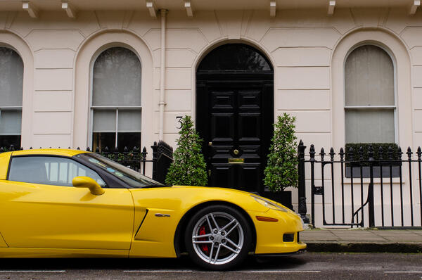
For a very simple change, the result is pretty good. This method has one huge limitation, though: as it works by thresholding each channel separately, we have no control over how it handles color. Only eight colors are supported: black, white, red, green, blue, cyan, magenta and yellow. The resulting image can only ever display these colors. This causes a number of issues:
- We have very little control over the result, and no way to adapt the color palette to better fit the image.
- These colors are very saturated, making most images very noisy, especially in large patches of grey or other desaturated colors.
- Because the output colors cannot be changed, this method doesn't work if the intended output device can only display certain colors, as would be the case if we wanted to display images on a vintage computer (or emulate the look of one with a custom palette).
We can increase the number of colors available pretty easily by thresholding twice or more, giving us multiple levels in each channel. This helps with the saturation issue and gives us more than eight colors to work with, but we still can't pick the exact colors we'd like. Since we're looking to dither images with specific palettes, let's forget about this technique and do something entirely different.
Arbitrary color dithering
Dithering images to an arbitrary color palette is the generic version of the black/white dithering we've been doing, which is a particular case. Specifically, one where the palette is made up of two colors, which we'll now define more precisely as their RGB representations: (0, 0, 0) and (1, 1, 1).
This may seem obvious, but thinking about it this way will help us get to the general case. When dithering in black and white, we started from a threshold function to decide which color each pixel should be: if the brightness of that pixel was below 0.5, we painted it black. If it was above, white. That is, the threshold function is essentially a way to check which color in our palette the original pixel was closest to.
This last part is key to understanding the process. Let's take our basic thresholding code, this time assuming color input and output:
for (x, y) in input
  color = input[x, y]
  output[x, y] =
    if (brightness(color) < 0.5) (0, 0, 0)
    else (1, 1, 1)
Now that we know the brightness threshold is just a way of checking whether the color is closer to black or white, we can write a generic version of the function:
palette = [(0, 0, 0), (1, 1, 1)]

for (x, y) in input
  color = input[x, y]
  output[x, y] = findClosestFromPalette(color, palette)
This code will do the same as the above, but it'll work with any colors we put in the palette array.
Let's take a closer look at the findClosestFromPalette function. For black and white, as we've seen, a simple threshold check will do, but that isn't the case for any palette. We'll need a way to find the closest color from a list, and that means a way to find the distance between colors.
Comparing colors
Finding the "distance" between two colors is fairly straightforward: we can think of colors as points in a three-dimensional space (those dimensions being red, green, and blue) and apply the formula for distance between two points in 3d space:
dr = color1.r - color2.r
dg = color1.g - color2.g
db = color1.b - color2.b

dist = √(dr² + dg² + db²)
Since we'll only care about whether distances are greater or lesser than one another, we can compare squared distances and skip the square root in our real code to save a bit of work. It seems like a small difference, but this code may be running hundreds or thousands of times per pixel, and small differences add up very quickly.
There are better ways to calculate distance between colors than this naïve approach, for instance using a perceptually uniform color space such as CIELab or OKLAB. I didn't find enough of a meaningful difference; at least with the small palettes we're using. A simple RGB distance works well enough, and a more accurate function isn't worth the much higher computational cost. This function will be running many times for each pixel in the image, so it needs to be as fast as possible.
Once we have this, finding the closest color in a palette is as simple as comparing the original pixel's color to each color in the palette and keeping the one with the smallest distance.
Error diffusion
Let's apply the color comparison technique to one of the dithering methods we learned in the last part. For the examples that follow, we'll be using this palette:
Error diffusion is the easiest algorithm to convert for arbitrary color palettes, since the way it does color comparisons and calculates error is very simple. We can esentially just "plug in" our findClosestFromPalette function and swap numeric brightness values for colors:
color[pal_size] palette = [...]
color[x, y] errorMap // Error for each pixel, initialized to zero

for (x, y) in input
  color = input[x, y] + errorMap[x, y]
  output[x, y] = findClosestFromPalette(color, palette)

  error = color - output[x, y]

  // Error diffusion
  ...
And just like that, it works! This is what error diffusion with an arbitrary palette looks like when using a Floyd-Steinberg pattern:

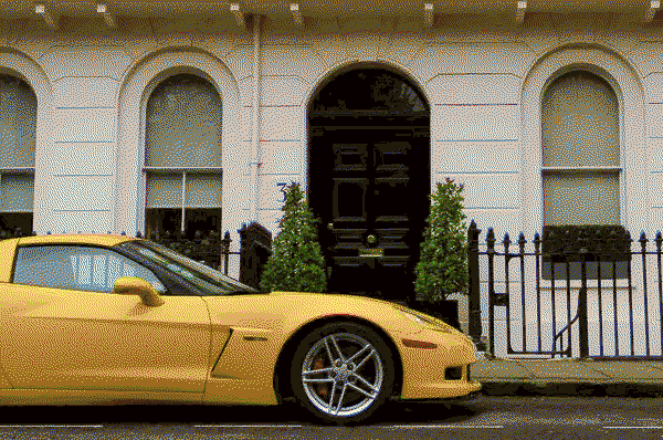
Looks pretty good! This is by far the easiest way to get good looking images with an arbitrary palette. As we've seen in the previous post, though, error diffusion has a number of issues, some particularly problematic with small palettes like this one. It can make some weird looking patterns, and doesn't work at all for moving images. That's where ordered dithering comes in.
And this is where things get complicated. Converting error diffusion to work with arbitrary palettes is easy because the dithering is entirely independent from the process of deciding which color to place for a given pixel, which means we were able to replace the threshold function with our custom color search without changing anything else.
Ordered dithering is built around the threshold function, so we can't do that. Instead, we'll need to find a way to make our color search work around a threshold. There's a few ways we can go about this.
Color pair thresholding
This is the easiest "naïve" approach, which I'll call color pair thresholding because that's exactly what we'll do. Thresholding only works on two colors, so for each pixel we'll first find whichever combination of colors from our palette is closest to the original in which ratio, and then apply a threshold between those two.
This is easier to understand with an example. Say we have a flat orange color, and our palette consists of pure red, yellow and blue. We determine that the mix of palette colors closest to our shade of orange is 75% yellow and 25% red, so we pick those two colors and set the ratio at 25%—anything below that is red, anything above is yellow. Then we apply a regular threshold map. This will make 25% of the pixels red and the other 75% yellow, averaging out to something close to the original orange.
In code, that looks something like this:
color[pal_size] palette = [...]
number[n, m] thresholdMap = [...] // Threshold map of size n * m

for (x, y) in input
  color = input[x, y]
  threshold = thresholdMap[x % n, y % m]

  mix = findClosestMix(palette, color)
  output[x, y] = if (mix.ratio < threshold) mix.color1; else mix.color2
The findClosestMix function should return two colors and a ratio between them. Note that the two colors aren't necessarily the two closest to the pixel's original color, rather any two colors that become closest when mixed at a given ratio.
We have to check every possible mix of colors to find the best one. Fortunately for us, there isn't an infinite number of possible mix ratios: it's limited to the size of the threshold map. Unfortunately for us, that's still a lot of mixes: for an 8x8 threshold map that's 64 different mix ratios.
Here's pseudocode for one way we could implement findClosestMix:
function findClosestMix(palette, color, mapSize)
  let bestMix
  let bestMixDistance

  for (color1 in palette)
    for (color2 in palette)
      for (ratio in [0 ... mapSize - 1])
        mixColor = color1 * (ratio / mapSize) + color2 * (1 - ratio / mapSize)
        mixDistance = distance(mixColor, color)
        if (mixDistance < bestMixDistance)
          bestMixDistance = mixDistance
          bestMix = {
            color1,
            color2,
            ratio
          }

  return bestMix
You may have taken a look at the code and immediately cringed at the triple-nested loops, and I don't blame you: this function is slow, and scales with the square of palette size, which is not good. We can optimize a little by not checking a lot of pairs twice, which speeds things up, but doesn't fix the O(n²) problem.
So, speed is not great, but how does it perform? This is what the process looks like when applied to an image:

Not great. It's mixing very different colors together and we're getting all kinds of weird patterns and artifacts. This happens because we told our program to find whichever mix is closest to the original color, but we didn't consider whether it would look good. One way to improve the result is by avoiding a mix of two very different colors. Without this restriction, the program might try, for example, to approximate a dark blue by mixing bright cyan and black, rather than using a slightly diffrent shade of blue already in the palette. The result will be, on average, mathematically correct, but it will look bad.
One thing we can do to solve this issue is change our mix comparison function to penalize a mix of colors very distant from each other. So our code becomes:
...
colorDistance = distance(color1, color2)
mixDistance = distance(mixColor, targetColor) + k * colorDistance
...
Here, we introduced a parameter k to control the weight of the color distance within a mix. The higher it is, the more the program will tend to mix colors closer to each other.
In this example, we control k indirectly with a variance parameter in an exponential scale: an increase of 1 in the value halves the penalty for mixing distant colors. The ideal value is highly dependent on the image and the palette being used. In this case, the best results seem to be between 3.0 and 4.0:

This looks better, but the penalties are a bit too harsh and we're getting a lot of solid color "blobs". We can work around this by reducing the penalty for mixes closer to 50/50 (a ratio of 0.5), thus favoring them over solid colors:
...
colorDistance = distance(color1, color2)
rmh = abs(ratio / mapSize - 0.5)
mixDistance = distance(mixColor, targetColor) + k * colorDistance * (0.5 + rmh)
...
The change is most noticeable with lower variance, where the result looks significantly better:

We're getting somewhere, but the image still isn't great. Low variance results in very obvious color banding and spots, and high variance produces a very noisy image. The colors aren't very accurate to the original image, either. That on top of the mix search being painfully slow with larger palettes makes this not a great option overall, and we can get much better results with error diffusion.
The biggest issue we're running into compared with the ED approach is the limit of each pixel only thresholding between two colors. If we can get rid of that limitation of ordered dithering, we'll have a lot of room for improvement. That means rethinking the way we use threshold maps.
A threshold map is just a grayscale image, a two-dimensional data array containing values between 0 and 255. So far, we've been using those values as thresholds, but in the end they're just numbers and we can do anything with them. Let's look at an interesting alternative.
Pattern dithering
This is an expanded version of a dithering algorithm named pattern dithering, so I'm using that name. It's the algorithm used by Adobe Photoshop to dither images when saving to a format with a limited color palette, like a GIF or indexed-color PNG.
Pattern dithering is by far the most powerful of the bunch. It consistently produces great looking images with any palette, and doesn't need any of the patchwork we had to do with our previous attempt. Let's see what it looks like:

It's also much faster than the two-color mix approach we talked about, scaling better with large palettes. It's not quite real-time fast on the GPU (optimizing it to run in real-time as a post processing effect is an interesting topic I might like to touch upon in the future), but it's still able to render fairly large images in a matter of milliseconds. So how does it work?
This method is more complex, and far more elegant, than the last one. Instead of looking for thepair of colors that make the best mix, we're going to find the best mix including any number of colors.
The way we're going to do this is by adding colors to a "candidate list", then choosing a color from that list based on the threshold map's value for that pixel. The threshold map values are transformed to each be an integer between 0 and n * m - 1, which we'll then use as an index to access the candidate list:
color[pal_size] palette = [...]
number[n, m] thresholdMap = [...] // Threshold map of size n * m

// Usually we want this to be n * m, a smaller one can be used for performance
number listSize = 64

for (x, y) in input
  color = input[x, y]
  threshold = thresholdMap[x % n, y % m]

  candidates = makeCandidateList(palette, color, listSize)
  output[x, y] = candidates[threshold]
How this works is far from obvious, so let's break it apart. We'll get to how we build the candidate list in a second, but first, how do we actually use it? A 64-color list wouldn't seem to make sense with a 16-color palette.
The key to this algorithm is to repeat colors within the candidate list. Because we're accessing the candidate list directly with the threshold map, it follows that the resulting mix is the average of all the colors in the list, repetitions included. Then, how many times a given color appears in the list is proportional to its "weight" in the mix. You can think of it like mixing paint: the more of a color you put in, the more the end result will look like that color.
More precisely, for any given pixel, the probability it will take a color c is #c/n, where #c is the number of times the color appears in the list and n the size of the list. This may be difficult to get across in words, so here's a visual demonstration: try making changes to the color list and see how that affects the final color.

Now we know how indexing the candidate list with a threshold map gives us a (close to) uniform mix of the colors in it, let's take a closer look at how it's actually built. This is, essentially, the core of pattern dithering. Interestingly, it shares some similarities with error diffusion dithering.
We have to start building the list somehow. We can start by adding the obvious candidate, the color from our palette closest to the original. Then, we calculate the error much like we would for error diffusion, only instead of spreading it over other pixels we take it into account when choosing the next color in the list, then accumulate the error for this second color. Repeat until the list is full, and we have our candidate list. Here's a simplified pseudocode implementation:
function makeCandidateList(palette, pixel, listSize)
  color[listSize] candidates = []
  color error = (0, 0, 0) // Accumulated error

  for (i in [0 ... candidates.size])
    target = pixel + error * errorCoeff
    candidates[i] = findClosestFromPalette(target, palette)
    error += pixel - candidates[i]

  sortByLuma(candidates)
  return candidates
Couple things to note about this implementation. First is that the candidate list is sorted by luminescence (luma) before returning it; this makes it consistent across similar pixel colors so the distribution is even when indexing with the threshold map (basically, it makes smooth color gradients look good).
The other thing to note is the errorCoeff constant, which can be parametrized. This is a straight multiplier on the error, and we can use it to control the "intensity" of dithering. A value of 0 nullifies the error entirely and gives the same result as no dithering whatsoever, while a value of 1 takes the full error into account. It's an interesting parameter to play around with:

Also interesting is that it seems to have a non-linear response, being rather closer to a logarithmic scale. With the right palette, very low values can give some aesthetically pleasing results, with plenty of solid colors and nice dithered gradients where those colors meet. For most images I find a value of around 0.10 to 0.20 looks best.
Finally, this isn't actually the full algorithm, as the real version has gamma correction built in. The way it does this is by gamma-correcting the palette colors as well as the pixel, and calculating distance between the gamma-corrected colors instead. This makes the colors look much better:

And here's the pseudocode modified to account for gamma correction:
function makeCandidateList(palette, pixel, listSize)
  color[] gammaPalette = palette.map(color -> gamma(color))

  color[listSize] candidates = []
  color error = (0, 0, 0) // Accumulated error

  pixel = gamma(pixel)
  for (i in [0 ... candidates.size])
    target = pixel + error * errorCoeff
    candidates[i] = findClosestFromPalette(target, gammaPalette)
    error += pixel - candidates[i]

  sortByLuma(candidates)
  return candidates.map(color -> ungamma(color))
And that's it! The actual code is a bit different, moving as much as possible outside of the per-pixel calculations for performance reasons, but functionality is the same. The results are great, and just like black-and-white ordered dithering, it works with any kind of threshold map:

Conclusion
Applying dithering with an arbitrary target palette makes things a lot more complicated, but the results are also much more interesting! As an ordered dithering algorithm, pattern dithering can be implemented as a GPU shader. The heavy computation required means it's not quite viable to run in real-time, let alone as a post-processing effect which should ideally take no longer than 2-3 milliseconds. Optimizing the shader to run in real time with a decent palette is an interesting topic I might explore in the future. For now though, this completes the series on dithering.
If you want to play around with the different algorithms presented in this series, try out your own images, different palettes or even your own custom colors, check out the DitherLab app on this site.
Further reading
-
This article by Joel Yliluoma is where I learned most of this stuff and the original source of the algorithms discussed here, so full credit for that. What I present here are adaptations of the algorithms in this article, and my contribution is mostly the GPU implementation used in DitherLab.
-
Not an article, but Acerola's video on Color Quantization and Dithering is a great dive into the real-time side of things. Though he doesn't cover arbitrary palettes, the video goes over some interesting techniques.
