Dithering is a technique used in image processing to make images look like they have more colors than they actually do. This article explains how dithering works, some of the different approaches to dithering, and what you can do with it.
What is dithering?
In technical terms, dither is noise intentionally introduced to a signal in order to hide unwanted large-scale patterns. For images, these are artifacts like the color banding seen when using a limited color palette. In layman's terms, it's a way to trick the eye into seeing more colors than are actually being displayed. This is achieved by mixing colors together in small, repeating patterns.
The human eye can only see detail up to a certain point, beyond which it starts to blur things together. The image below is a grid of alternating black and white tiles. Try zooming all the way out by dragging the Zoom slider to the left:
Zoomed all the way in, the tiles are clearly visible, but as you zoom out they start to blend together into gray. This is an illusion: your display is really only showing pure black and white pixels, but pixels are tiny, so your eyes start to mix together equal parts black and white into gray.
The last example used an equal amount of black and white tiles, which looks like a 50% gray. We can change the shade of the perceived color by making more or fewer of the “tiles” or pixels black or white. Try moving the brightness slider toward both ends:
By altering the ratio of white to black pixels, we can make the resulting gray brighter or darker. More white pixels make the rectangle lighter on average, and so it looks brighter, while more black pixels make it darker. At each end, all pixels are either black or white and that's the color you see.
This doesn't just work for black and white, we can use it to “mix” any two colors:
And the effect isn't limited to just two colors, either. In the example below, black is mixed with the three RGB primaries to approximate almost any color. You can play around with the RGB sliders to change the “target” color we're trying to match, which is shown in the box at the top.
This is the working principle of dithering: by mixing a few base colors in tiny patterns, we can trick our eyes into seeing shades in between.
Why dithering?
Modern displays and image formats can display some 16.7 million colors. That's a lot. This hasn't always been the case, though. Back in the early days of computers, most devices had monochrome screens with only a few brightness levels. Early color displays supported as few as 16 or even just four colors at a time. In the 1990s, many computers could only display 256 colors—the old 216-color “web safe” color palette was meant to ensure websites would have a consistent look on most displays—and some popular image formats of the time, like GIF, were limited to a 256 color palette.
In these low-color situations, dithering helps reduce color banding and effectively increases the number of colors we can display. Generally speaking, dithered images just look much better (click each image to view in detail):


These days, most displays are capable of showing at least 16.7 million colors, and modern compression algorithms are far more effective at reducing file size while preserving colors and detail than any form of dithering with reduced color depth.
That doesn't mean dithering is entirely obsolete, though: 16.7 million is a big number, but it's not infinite. Dithering is still widely used in some practical applications, for example when converting a professional camera's output (which may have as many as 281 trillion different colors) to 24-bit color. Other than that, it makes for some cool retro-looking images. We'll be focusing mostly on the latter.
How dithering works
We've seen how we can create different colors by mixing a few base colors together—we'll call these primaries. In this section we'll explore different ways to decide where to mix which primaries to best reproduce the original, full-color image. To make things simpler and the effects of dithering clearer, we'll go back to pure black and white for the moment.
I'll describe any dithering algorithms in pseudocode, along with an interactive (where possible) demonstration of the results. All algorithms will follow some conventions:
inputandoutputare image buffers. Pixels are read and set by[x, y]coordinates.- Images are assumed to be grayscale unless otherwise specified. Grayscale pixel values are referred to as
valueand treated as numbers, while color pixel values are referred to ascolorand haver,g, andbnumber members. - Values (grayscale or RGB) are in the range [0, 1].
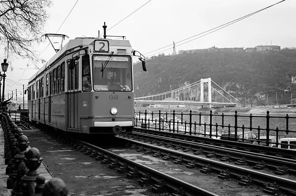
The interactive demos will use this grayscale image:
Thresholding
Thresholding is the conversion to a reduced color range itself: the brightness or color values for each pixel are compared against a numerical threshold to determine which color will be used. While not dithering in itself, all dithering methods do this at some point, so it's a good place to start.
The thresholding process for converting grayscale to black and white is very simple:
for (x, y) in input
  value = input[x, y]
  output[x, y] = if (value < t) 0; else 1
Where t is the threshold that controls whether a certain value should resolve to black or white. Try dragging the slider for t towards each end.

This is the simplest process to reduce an image to fewer colors, and it's very fast. It's far from ideal, though: we introduce a lot of artifacts, like very noticeable color banding, and drop a lot of detail.
Random dithering
This is the simplest form of dithering: we just add random noise to the image before reducing the colors. Random noise dithering code might look something like this:
for (x, y) in input
  value = input[x, y]
  noise = k * (random(0, 1) - 0.5)
  output[x, y] = if (value + noise < 0.5) 0; else 1
The parameter k controls the amplitude or “amount” of noise applied to the image. You can try it out below:

You might be wondering how adding noise to an image helps us preserve detail. It seems counterintuitive, but it helps to think of it in terms of probablity. This works because we're adding some “fuzziness” to the image, making some pixels pass the threshold when they normally wouldn't. This is easier to understand by seeing it, so below is a visual demonstration of the effect noise has on thresholding.
The graph takes a sample of a flat gray color shown in the “target” box, placing brightness along the y axis. The white line indicates the threshold, while the points connected by the red line represent sampled points (i.e., pixels). Each point is shown with the color it will take after thresholding. The “sample average” box shows the average of all sampled points after thresholding.
As you can see, for the initial brightness level of 35% the sample average is black, because 35% is less than the 50% threshold and so all points become black. Try adding some noise by dragging the k slider all the way to the right:
As you add noise, some points go above the threshold and become white. At k = 1, the noise added to each pixel is anywhere between -0.5 and 0.5, with a perfectly flat distribution. Because the base value is 0.35, that means each pixel's value is somewhere between -0.5 + 0.35 = -0.15 and 0.5 + 0.35 = 0.85. With a flat distribution, the chance of any given value in that range being over the threshold of 0.5 is 35%. That means given enough pixels, the average value after thresholding will converge at 0.35—that is, we'll have 35% white pixels and the image will look like 35% gray.
Try playing around with different brightness levels, noise levels, and sample sizes before moving on.
The problem with this approach becomes clear by looking at the results: it just looks... bad. Adding random noise with a flat probability distribution gives us the right color values on average, but we're not taking into account other variables. More specifically, we've been ignoring the frequencies of noise we're using.
This might sound confusing at first. Isn't frequency a property of waves, like sound? The idea of images as a superposition of waveforms is extremely interesting, has very practical uses (it's how JPEGs work!) and is way beyond the scope of this article, so I'll leave some links in a "further reading" section at the end and oversimplify the point:
When it comes to noise in an image, frequency is effectively how fine the detail is. High frequencies will appear as very fine-grained "static", while lower frequencies will generate larger "clumps" of light and dark pixels. The latter are much more noticeable at first glance, because they're larger.
So far, we've been using what's known as white noise, which has equal intensity at all frequencies. We want to avoid the low frequencies, because they show as easily recognizable clumps of color. To do that, we can use a different tipe of noise: blue noise, which is stronger at higher frequencies.
We'll look into using blue noise at a later point. For now, let's look at an entirely different technique.
Error diffusion
Error diffusion dithering is simple in principle and very effective. Instead of just adding noise at random, we measure the error for a pixel (how much we “missed” by when assigning a primary), and then distribute (or diffuse) that error along adjacent pixels. This way if we made a pixel darker than it should be, we'll make the adjacent pixels a little brighter to compensate, and viceversa. An error diffusion algorithm might look something like this:
number[x, y] errorMap // Error for each pixel, initialized to zero

for (x, y) in input
  value = input[x, y] + errorMap[x, y]
  output[x, y] = if (value < 0.5) 0; else 1

  error = value - output[x, y]

  // Error diffusion across pixels to the right and below
  errorMap[x + 1, y] = error / 2
  errorMap[x, y + 1] = error / 2
The result looks like this (Click to view in detail):

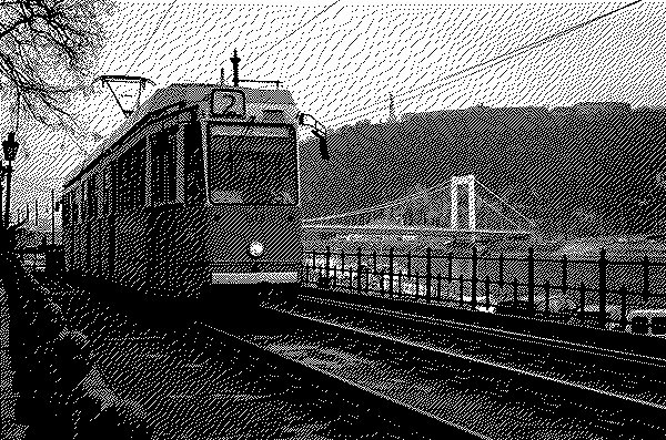
While there are still visible patterns, this is already much cleaner than simple white noise dithering. However, we can improve the error diffusion algorithm even further.
The above implementation uses an overly simplified diffusion pattern: half the error is propagated to the pixel to the right, half to the pixel below. If we were to draw it as a matrix, it would look something like this:
* 1
1 .

(/2)
Where * is the source pixel, and each number represents the portion of error propagated to that pixel. (/2) indicates that all numbers are divided by two. Think of it as splitting the error into two equal parts, then assigning one part to each pixel.
In practice, more complex diffusion patterns are used to achieve better results. Patterns that distribute error across more pixels usually result in a smoother image. You can compare some of the most popular ones below (click each image to view in detail):


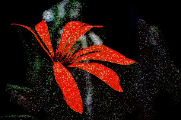
Error diffusion is a much better algorithm than simple random noise, and is often used for dithering static images. It works especially well with very large color palettes, for example when reducing a camera's 14 or 16-bit image to standard 8-bit color. It's not without its drawbacks, however. With limited palettes, error diffusion dithering can produce very visible noise, color bands and “ghosts”. The image below shows an extreme case of these artifacts:
The other major drawback is related to the way error diffusion works: because the final value of a pixel depends on every single pixel that came before it, it can't be calculated in parallel (for instance in GPUs). This makes it rather slow to compute in real time, which is why you didn't see any interactive examples in this section.
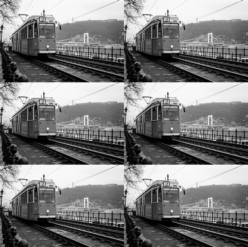
Also because of this, it doesn't work very well for animation or video, as a single pixel change can make the entire image shift around:
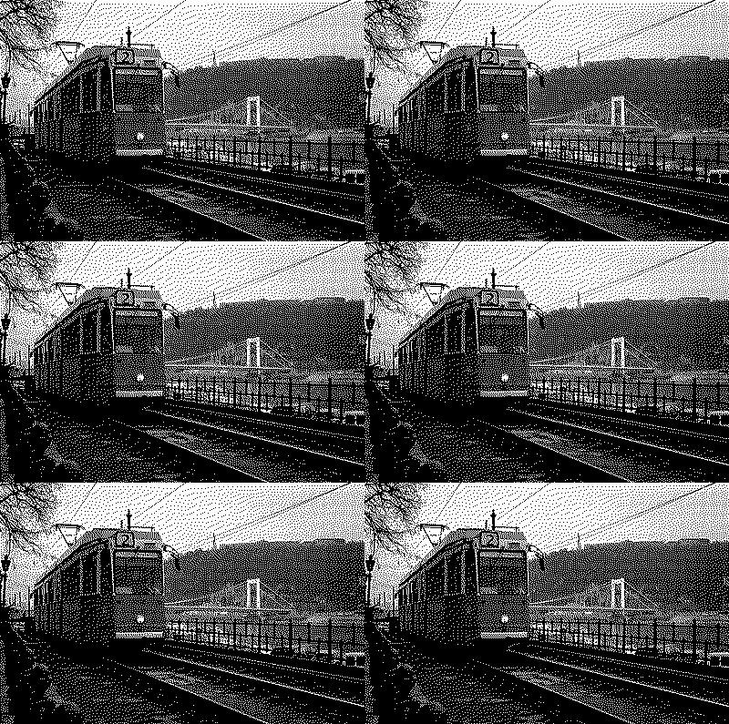
Next up, we'll look at a dithering method that solves these issues.
Ordered dithering
An ordered dithering algorithm solves the problems of error diffusion by making the calculations for each pixel entirely independent from each other. The white noise algorithm from earlier already has this property, so let's go back to that:
for (x, y) in input
  value = input[x, y]
  noise = k * (random(0, 1) - 0.5)
  output[x, y] = if (value + noise < 0.5) 0; else 1

This algorithm is stateless: it doesn't keep any internal state, and operates on each pixel independently. In other words, there's no code outside the main pixel loop. This makes it ideal for animation, and easy to implement as a GPU shader.
Let's look into it a little further. This example can be rewritten to think of the noise as adding to the threshold, rather than the input:
for (x, y) in input
  value = input[x, y]
  noise = k * (random(0, 1) - 0.5)
  threshold = 0.5 + noise
  output[x, y] = if (value < threshold) 0; else 1
The new code is mathematically identical, just rearranged in a more helpful way. This method is already a basic form of ordered dithering, but we're back to the issue of white noise looking bad. How can we fix that?
Blue noise would be one way, but it's not that simple, as we'll see later. Instead, we'll sample the threshold from a predetermined threshold map, rather than calculate it on the fly:
number[n, m] thresholdMap // Threshold map of size n * m
// Initialize threshold map with some values

for (x, y) in input
  value = input[x, y]
  threshold = thresholdMap[x % n, y % m]
  output[x, y] = if (value < threshold) 0; else 1
The threshold map doesn't need to be the same size as the image: it is “tiled” as many times as necessary in both dimensions. This leaves only the matter of filling our threshold map with some values.
Understanding threshold maps
To understand what threshold maps are and why they work, let's go way back to the very first example with the black and white tiles. Try dragging the slider all the way to the right:
As the amount of white pixels increases, the entire square becomes brighter. The square is 16 (4×4) pixels in size and has a total of 17 possible brightness levels, from no white pixels to all 16. If we can reduce our image to 4×4 pixel tiles and 17 brightness levels, we can assign a pattern to each possible brightness:

By doing this we can display 17 levels of brightness with just two colors!
The problem with this approach is we lose a lot of resolution: As long as we assign one pattern per tile, the number of brightness levels is limited by the size of the tiles. Instead, we can reduce the tile size, and have the 4×4 pattern cover multiple tiles. Try changing the tile size to 2×2 or even 1×1:

At a tile size of 1×1, each tile covers a single pixel—there is no resolution loss at all! This is how ordered dithering works: each pixel takes its color from a different part of the repeating pattern, depending on its own value.
Threshold map patterns
Let's go back to the grid example one last time. Drag the slider slowly towards the highest brightness, paying attention to the position of white pixels:
As you increase brightness, white pixels start appearing in a certain pattern. We can see the pattern more clearly by painting each tile with the brightness it needs to be “turned on”—in other words, its threshold—instead of white:
The pattern you see in this last example with brightness turned all the way up is the actual threshold map. Try zooming out to see it repeating.
This pattern is a 4×4 bayer matrix, a common threshold map for ordered dithering. It is a mathematically defined matrix of size N × M, containing all values in the range [0; M × N) such that each number is as far as possible from its immediate succesor. For example, the smallest 2×2 bayer matrix is
0 3
2 1
For dithering, the matrix is normalized: every value is divided by N × M, so we get threshold values between 0 and 1. Ordered dithering with a bayer matrix is mathematically very accurate, but produces noticeable artifacts in the form of a characteristic cross-hatch pattern. You can try out different matrix sizes below:

The cross-hatch pattern produced by a bayer matrix can sometimes be desirable for aesthetic reasons, but might also be unwanted. In these cases, a threshold map without any discernible patterns would be best. White noise, as we've seen, doesn't work. This is were blue noise finally comes in.
Generating blue noise is fairly complex and outside the scope of this article, which is why I haven't talked about it in detail before. For our purposes, we can just use pre-generated blue noise textures as a threshold map (the linked site has plenty available to download). You can try out ordered dithering with a blue noise threshold map below:

Other patterns can be used as well—there's no restriction to what can be in a threshold map. For example, it can be used to form a coarse, halftone-like pattern:

Ordered dithering is the most versatile method: it can be used with any number of patterns to achieve different looks, and because each pixel is processed independently it is ideal for animation or moving images. The algorithm can also be easily implemented on the GPU as a shader, which makes it possible to dither images or video in real time.
Conclusion
So far, we've learned what dithering is, why it's useful (or fun), and how it works. In the next part, we'll explore how we can expand our dithering algorithms to work in color, with an arbitrary set of primaries or color palette.
Further reading
There's a few things I mentioned in this article, but didn't explain in detail because it's already long enough. There's other cool people on the internet who have, though. Here's some recommended articles on topics I touched on:
-
An Interactive Introduction to Fourier Transforms by Jez Swanson. If you liked this format, this is more of the same. A very well written article about a very interesting topic, and it has a part explaining the images-as-waveforms thing I mentioned.
-
On the topic of Fourier transforms, this video by 3Blue1Brown, while not an article, is probably one of the best explanations of the Fourier transform on the internet.
-
Dithering in games by Bart Wronski. These articles touch on similar topics to this one, but go into much more technical detail and focus on the practical aspects of dithering in modern computer graphics.
-
Blue Noise by Christoph Peters goes into detail about using noise for dithering, and has a section on the actual generation of blue noise.